Executive Summary
Qwen-Image-2.0 was announced on 10 February 2026 by Alibaba's Qwen team, claiming superior text rendering and native 2K output. The model is currently in invitation-only beta; the publicly available qwen-image-max on DashScope was tested instead. This report compares it head-to-head with Gemini nano-banana-pro-preview (the model behind the /gemini-images skill) across four use cases matching the existing image generation templates.
1 Comic Strip
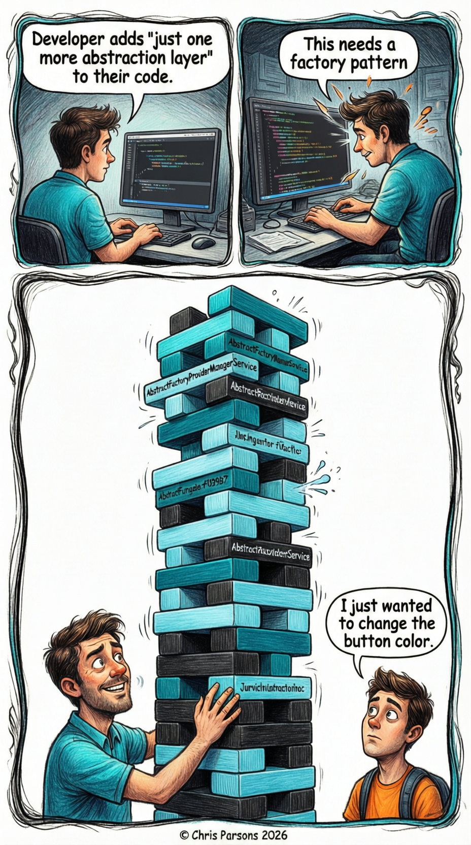
Qwen qwen-image-max
Gemini nano-banana-pro-preview
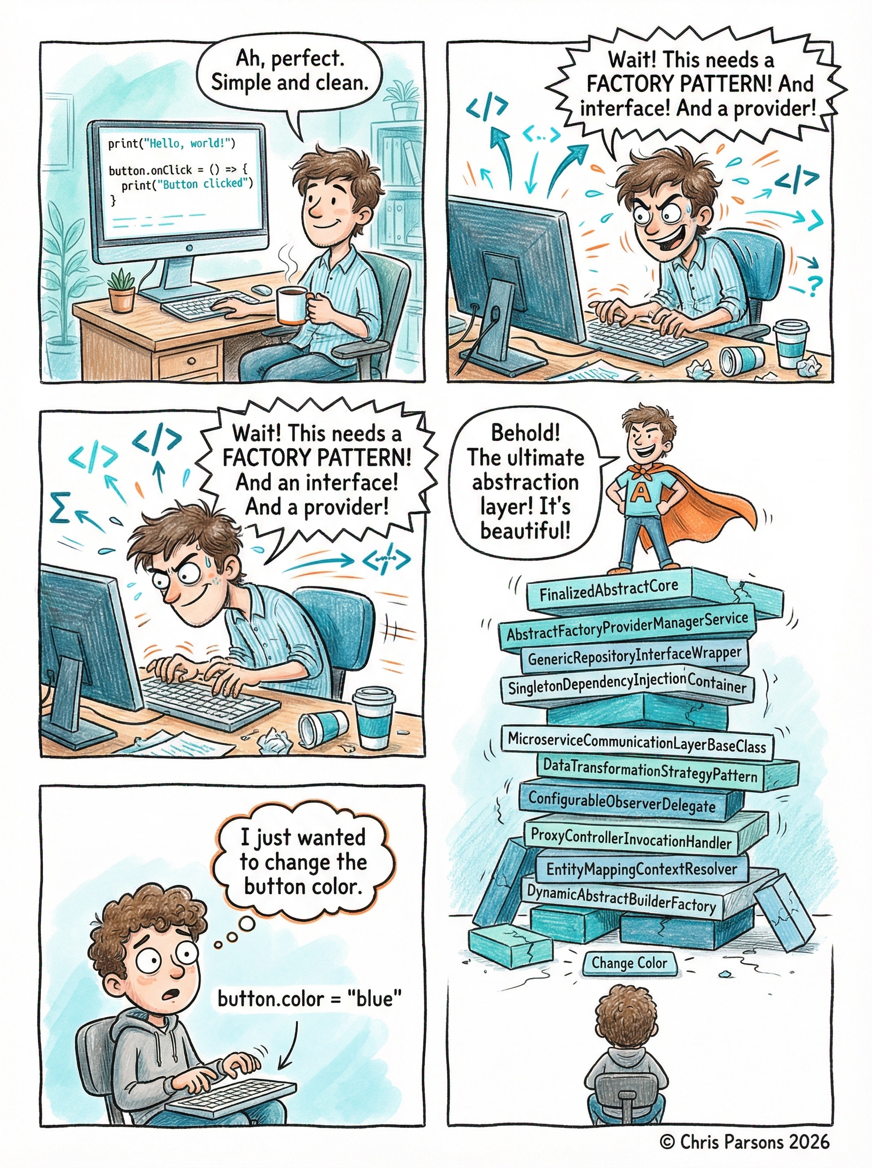
Analysis
| Criteria | Qwen | Gemini |
|---|---|---|
| Style match | Semi-realistic digital illustration. Not the hand-drawn pencil aesthetic requested. | Nails the whimsical colored-pencil look. Exactly on-brand. |
| Storytelling | 3 panels, adequate but compressed narrative. | 5 panels with better arc. Added superhero cape gag — creative embellishment. |
| Speech bubble text | Legible, fewer words. | More text, all legible, funnier dialogue. |
| Code/class name labels | Garbled and blurry on the Jenga blocks. | Readable: "AbstractFactoryProviderManagerService", etc. |
| Brand colours | Generic blue/teal. Not distinctly on-brand. | Closer to the turquoise/orange palette specified. |
| Copyright footer | Present and correct. | Present and correct. |
2 Infographic
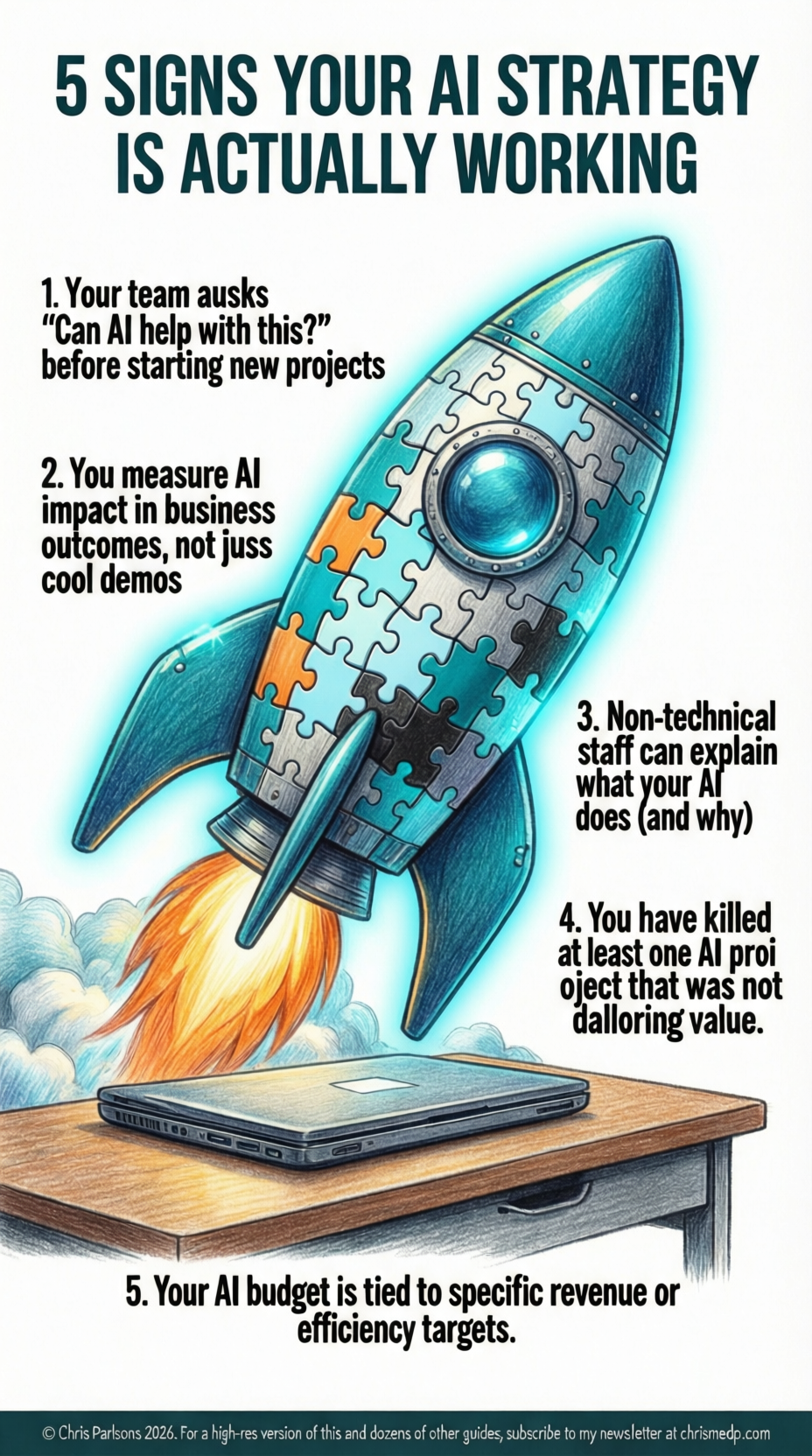
Qwen qwen-image-max
Gemini nano-banana-pro-preview
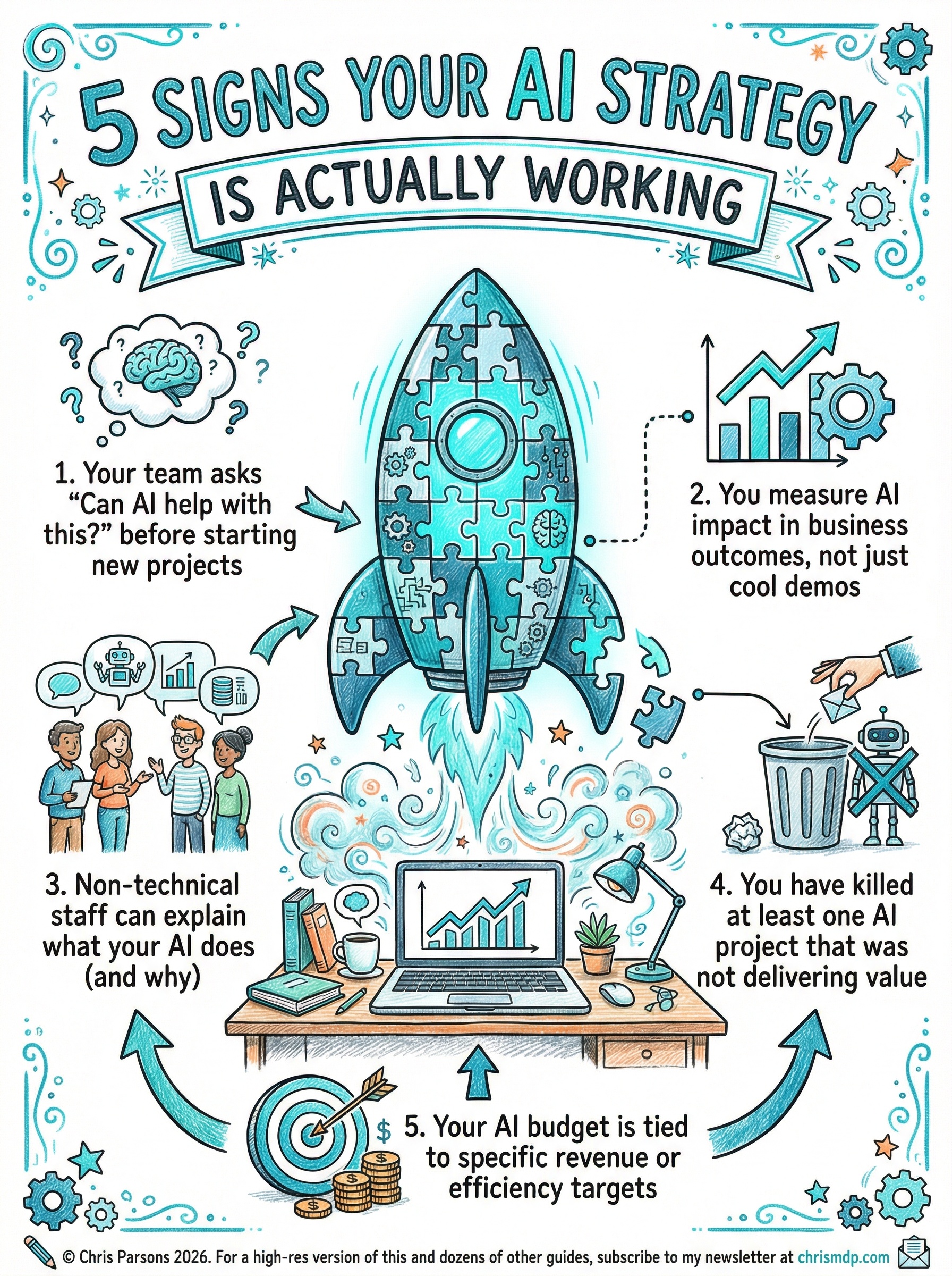
Analysis
| Criteria | Qwen | Gemini |
|---|---|---|
| Title | Present and bold. | Present, bolder, with better styling. |
| Central motif | Puzzle rocket present, reasonable quality. | Excellent puzzle rocket, more whimsical and engaging. |
| Text accuracy | Multiple typos: "ausks" (asks), "juss" (just), "proj oject" (project), "dalloring" (delivering). Dealbreaker. | All text correct. Zero typos across all 5 points. |
| Layout | Text down one side only. Less dynamic composition. | Text arranged around centrepiece with supporting illustrations (people, gears, charts, rubbish bin). |
| Footer | Says "2024" — wrong year. | Correct: "2026", includes chrismdp.com. |
3 Presentation Slide
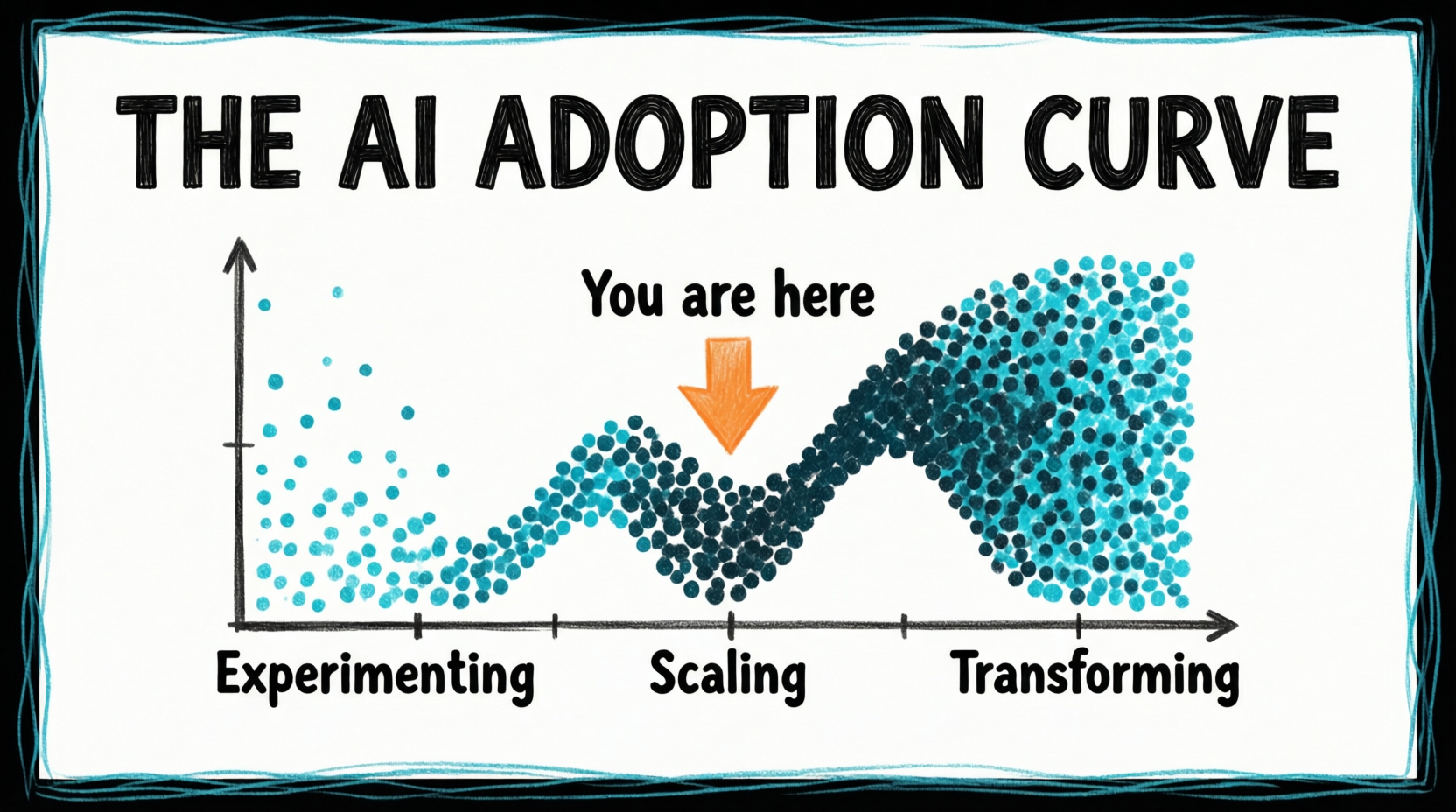
Qwen qwen-image-max
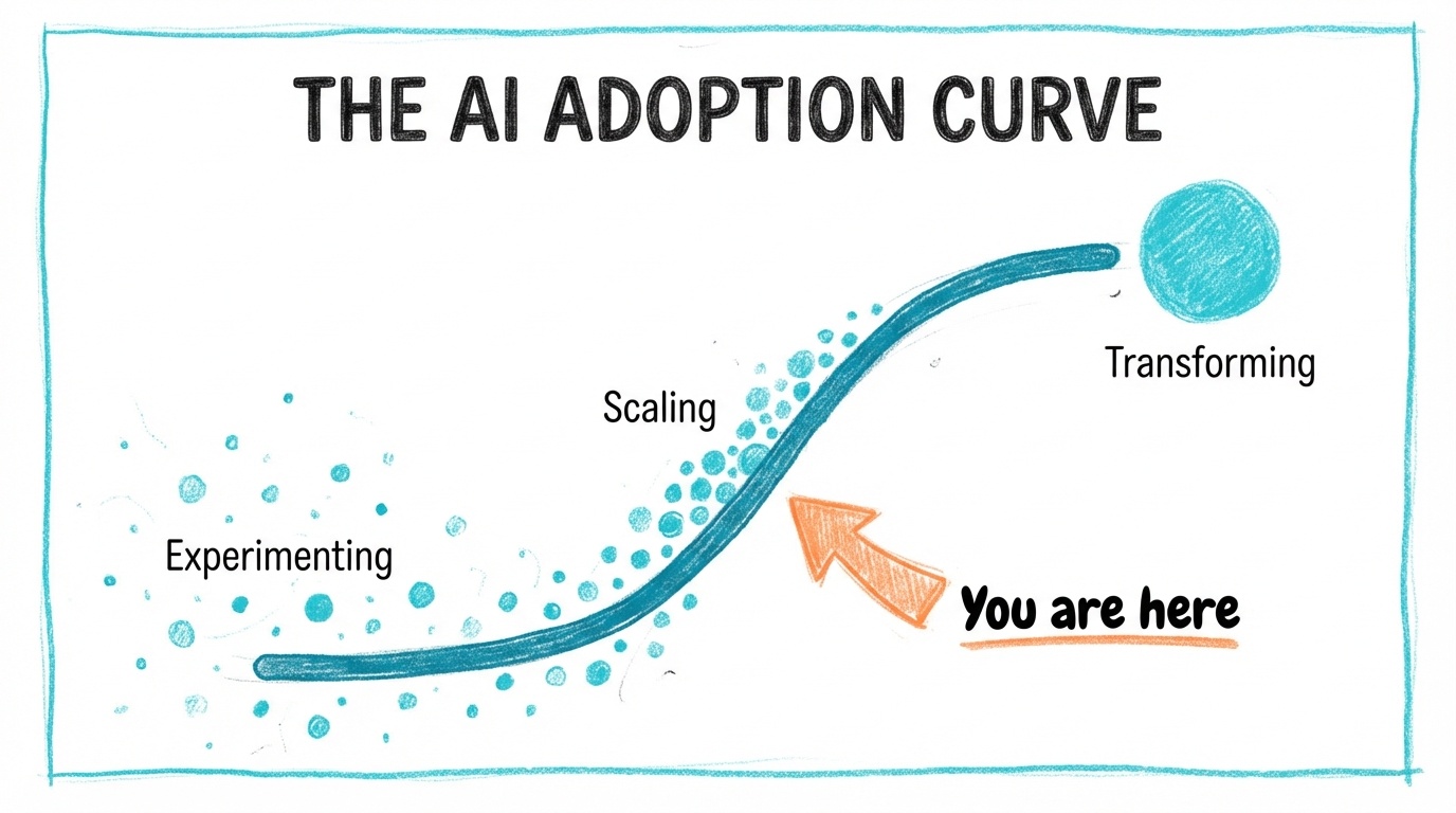
Gemini nano-banana-pro-preview
Analysis
| Criteria | Qwen | Gemini |
|---|---|---|
| Data visualisation | Excellent. Proper S-curve with dot clusters showing density changes. Reads like a real chart. | Abstract swooping line. More artistic but less informative as a data viz. |
| Text labels | All three labels perfect and well-placed on the x-axis. | All three labels present and readable. |
| "You are here" arrow | Orange arrow pointing down at the correct position on the curve. | Orange arrow present but positioned at the bottom, disconnected from the curve. |
| Wobbly border | Turquoise sketch border, present. | Turquoise sketch border, present. |
| Minimalism | Clean, tight, information-dense without clutter. | Spacious, visually appealing but curve itself is less useful. |
4 Text Rendering (Quote Card)
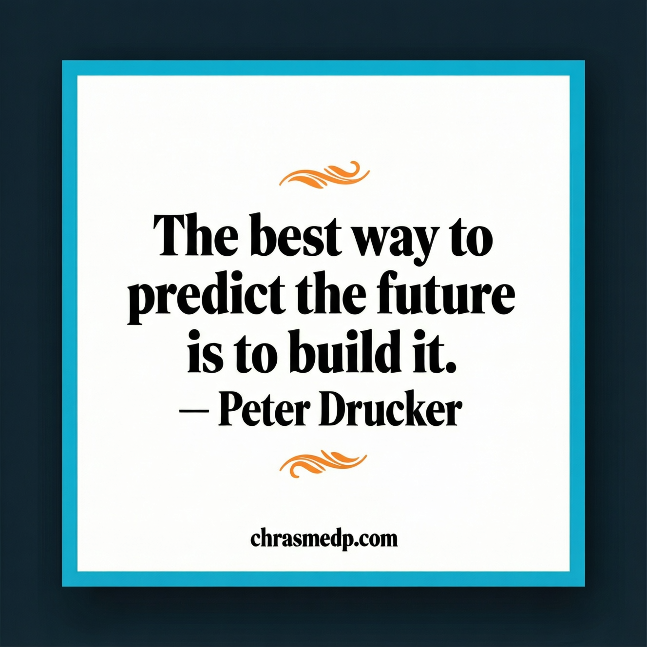
Qwen qwen-image-max
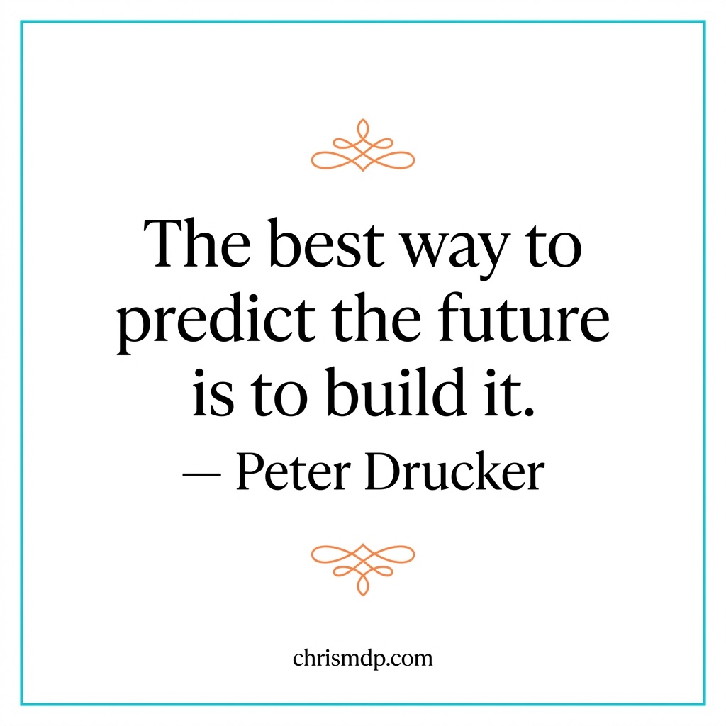
Gemini nano-banana-pro-preview
Analysis
| Criteria | Qwen | Gemini |
|---|---|---|
| Quote text | Perfect rendering, elegant serif font. | Perfect rendering, elegant serif font. |
| Attribution | "— Peter Drucker" — correct. | "— Peter Drucker" — correct. |
| URL text | "chrasmedp.com" — misspelled. Letters transposed. | "chrismdp.com" — correct. |
| Orange flourishes | Present, small and subtle. | Present, more ornate and decorative. |
| Border | Turquoise border present. | Turquoise border present. |
| Overall composition | Dark surround outside the border feels off-brand. More compact. | Clean, spacious, white surround. On-brand. |
Conclusions & Recommendations
Where Gemini excels
- Text accuracy — Zero errors across all 4 tests. Qwen had typos in 2 of 4 (infographic and quote card), which is a dealbreaker for professional content.
- Style adherence — Consistently delivers the hand-drawn colored-pencil aesthetic that the brand templates specify. Qwen defaults to a more photorealistic digital illustration style.
- Resolution — Native 2K output (up to 2304px tall for infographics). Qwen caps at 1664×928, which can't meet the infographic template spec of 1856×2304.
- Creative interpretation — Added the superhero cape in the comic, the rubbish bin for "killed projects" in the infographic. More inventive with the brief.
Where Qwen excels
- Data visualisation — The presentation slide S-curve was genuinely better composed, with dot clusters that communicate density changes intuitively.
- File weight — Consistently higher-resolution output files (1.6–2.5 MB vs Gemini's 0.1–1.6 MB), suggesting more detail per pixel.
- Price — $0.075/image vs Gemini's usage-based pricing. 100 free images on signup.
Key limitations of Qwen-Image-Max
- Max resolution 1664×928 — Can't produce the 1856×2304 infographics or 1920×1080 presentation slides at native resolution.
- Text rendering errors — Despite marketing claims about superior text handling, produced "ausks", "juss", "dalloring", and "chrasmedp.com" in testing.
- Style rigidity — Tends toward photorealistic rather than adapting to the requested hand-drawn aesthetic.
- No inline image return — Returns a temporary URL (expires in 24h) rather than base64 data, adding complexity to automation.
Recommendation
Stick with Gemini for the /gemini-images skill. Qwen-Image-Max is not a viable replacement for any of the current template types. The text accuracy problems alone are disqualifying — you can't publish infographics with "dalloring" instead of "delivering".
Worth revisiting when Qwen-Image-2.0 gets a public API (currently invitation-only on Bailian). The 2.0 model claims 2048×2048 native output and improved text rendering, which could address the two biggest gaps. Monitor the DashScope model list for a qwen-image-2.0 or updated qwen-image-max model name.
One possible niche use: If you ever need chart/diagram-style slides where data visualisation matters more than brand aesthetics, Qwen could serve as a secondary option.